
Since first appearing in the early 1900s, the Shell logo has moved from a realistic rendering of a pecten, or scallop shell, to today’s bold shape with distinctive colours.
The origins of the oil company are in the antiques business. London shopkeeper Marcus Samuel saw a trend of fashionable people using shells for interior decorating, so in the 1930’s, he began importing shells from the Far East. When he passed away, his sons (Marcus Jr. and Sam) took control of the company and used the shipping capabilities to export British machinery, textiles, and tools while importing rice, silk, china, and copper. Marcus Samuel Jr. became interested in the oil market and soon the company became prominent in the oil shipping and transport business, and established the name “Shell Transport and Trading Company.” With the emergence of service stations in California in 1915, the company needed to differentiate itself and decided to do so with color. Due to the state’s strong Spanish connections, red and yellow were perceived to be the most favorable.
Shape and form between 1900 and 1930

It was around 1915 when the rendering allowed for easier reproduction, shown in the 1930s symbol above.
Colour brought in around 1915

Colour first appeared with the construction of Shell’s first service stations in California. Not only did Red and yellow help Shell stand out, but they’re also the colours of Spain, where many early Californian settlers were born. Perhaps by displaying Spanish colours it was hoped an emotional bond would be created.
An alternative idea about the Shell colours was that Mr Graham, the Scottish director, suggested using red and yellow, as they form the basis for the Royal Standard of Scotland.
1948 to 1971

In the days before fax machines and the internet, many logos included subtle details that would become blurred at small sizes. From the 1950s onwards, the icon became more and more simplified, improving recognition and memorability.
The 1971 logo, which is still used today, was designed by the French-born engineer, Raymond Loewy, who also created logos for BP and Exxon.He is also best known for his designs for steam locomotives and refrigerators.
1995 onwards

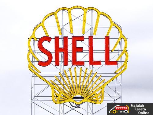
The logo has become so recognizable that it often appears without the company’s name to identify it.
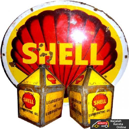
This sign is one of the olders version found it in Cambridge, Massachuset
source:perpenduum,logodesignlove

Jom komen!